Linotype Revival
Linotype wanted to re-inspire people’s love for the typeface Bodoni as well as increase sales of the classic font.
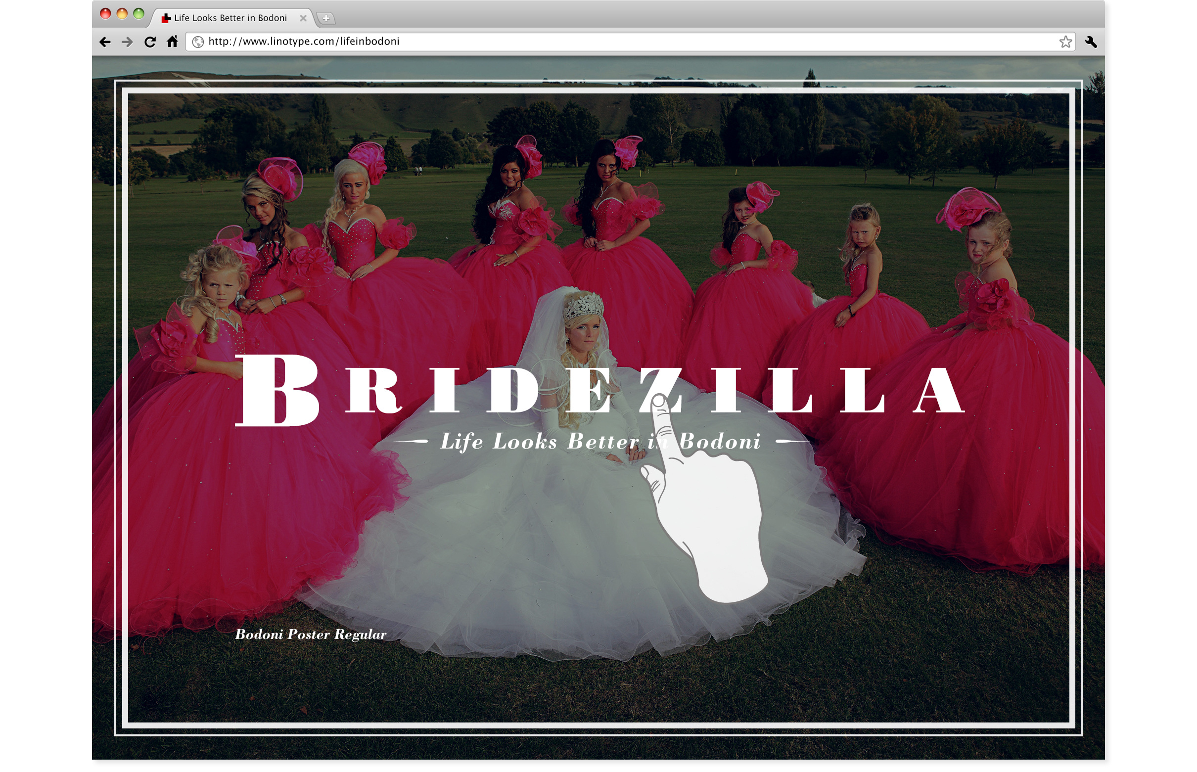
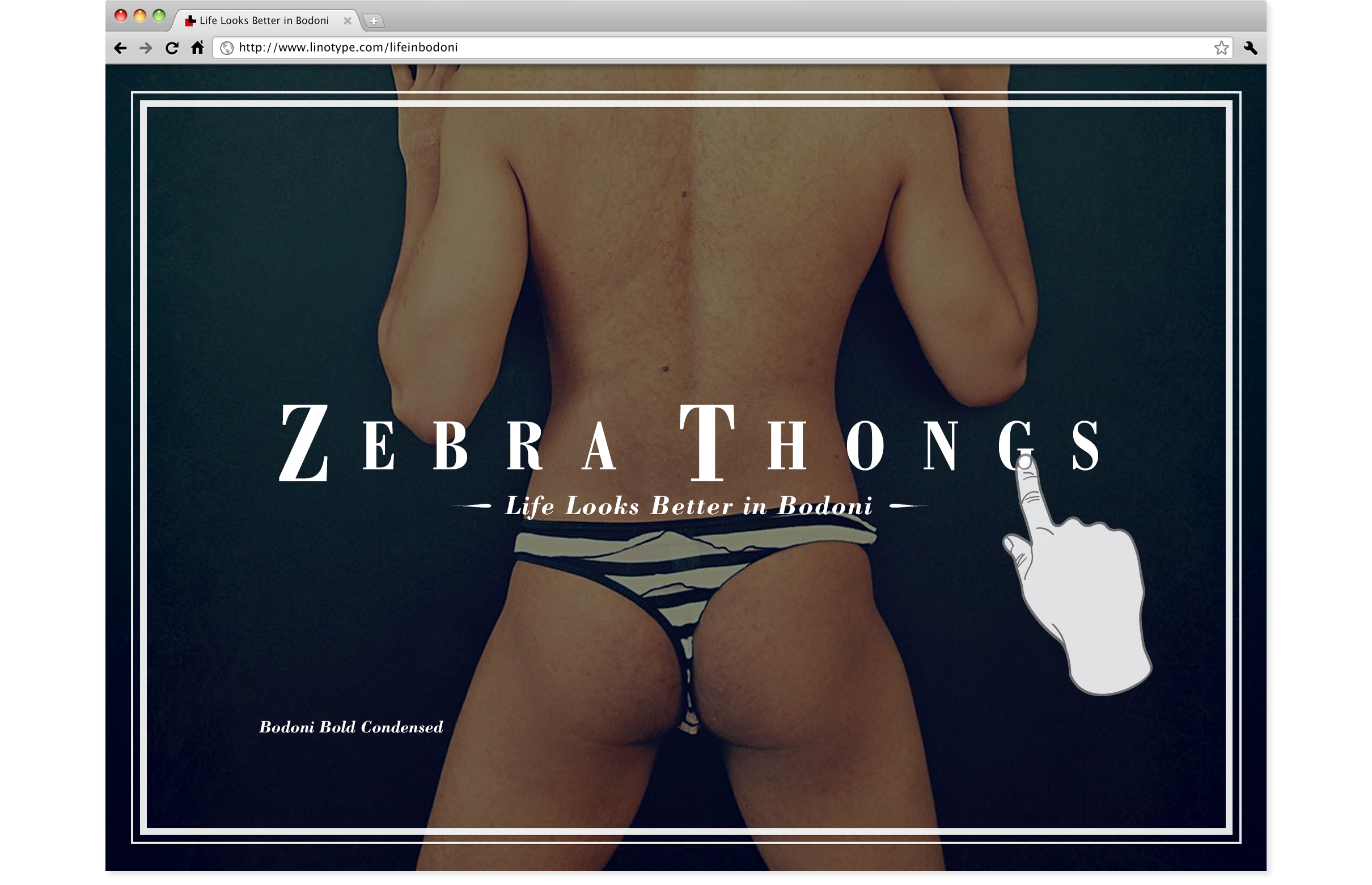
The concept behind ‘Life Looks Better in Bodoni’ is that some of the least palatable situations in life can be improved if recast with the magic touch of the Bodoni typefaces.
My Roles: concepting, art direction and design.

Examples of Bodoni
The 18th century typeface designed by Italian typographer Giambattista Bodoni is seen today in a wide variety of places. Most commonly in the world of fashion but also occasionally in the world of music.
The Idea
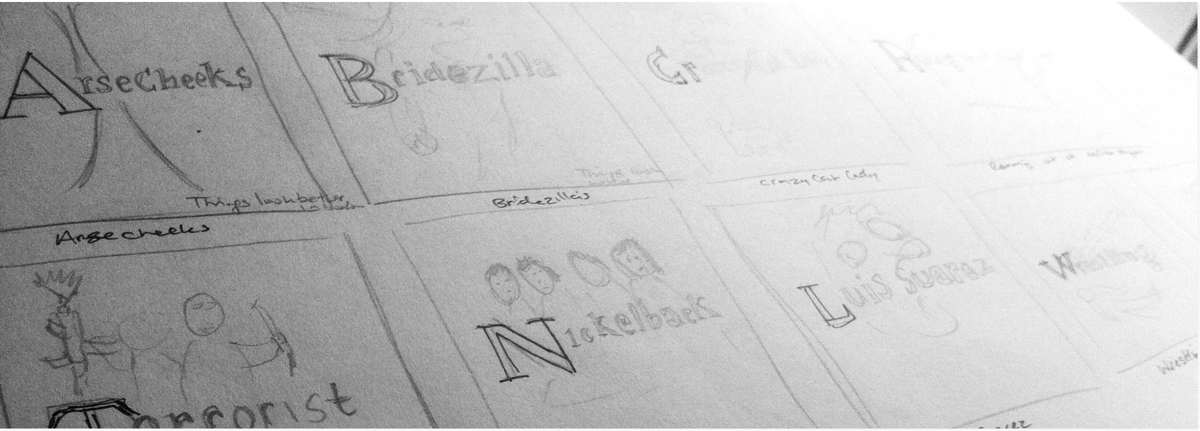
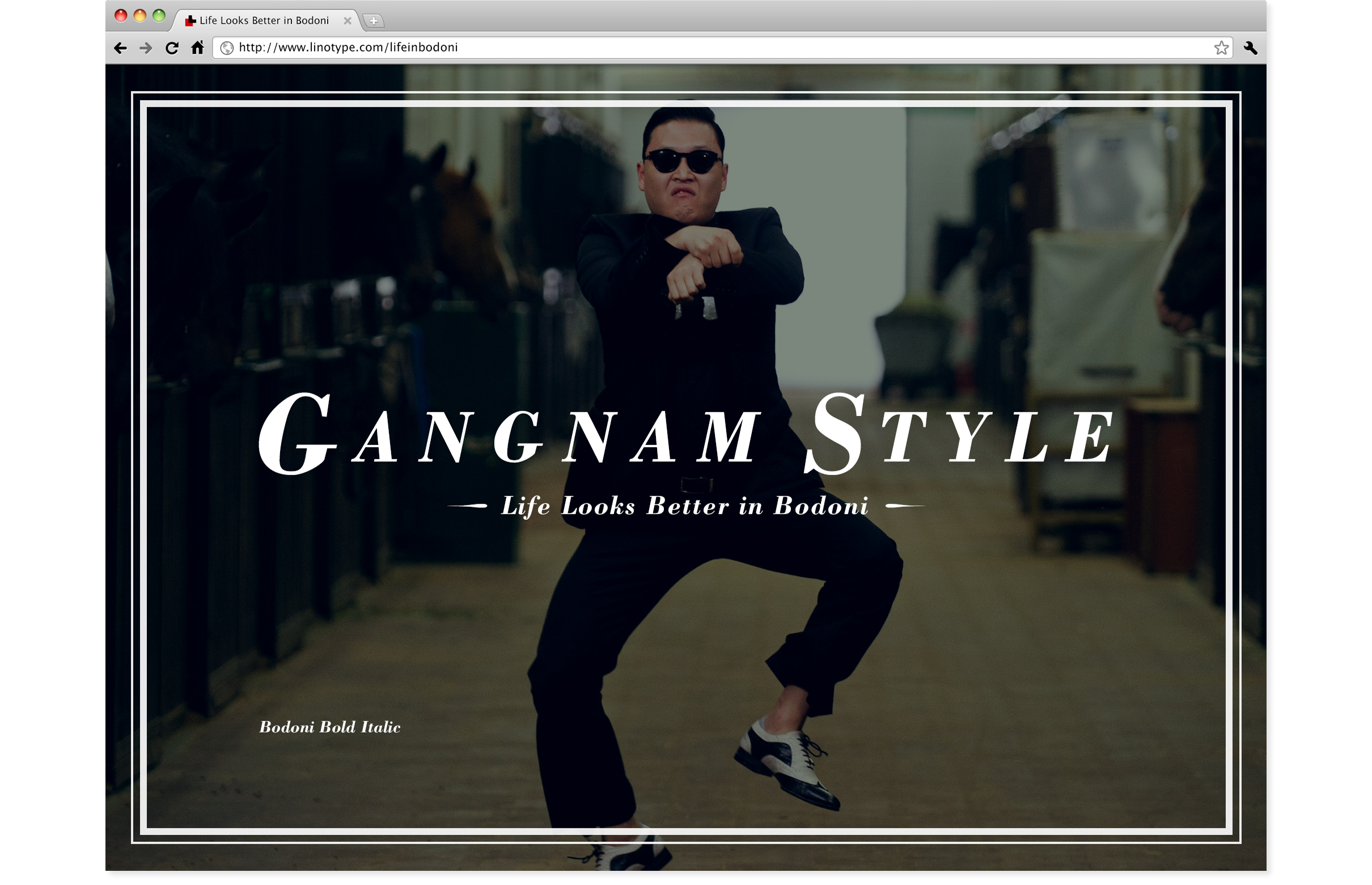
From my research I noticed that Bodoni is typically used to make things appear fashionable or sophisticated. I wondered if could it make even mundane things look better so I placed the fashionable typeface alongside unexpected things in everyday life to create a series of harmonious juxtapositions and called it ‘Life Looks Better in Bodoni’.
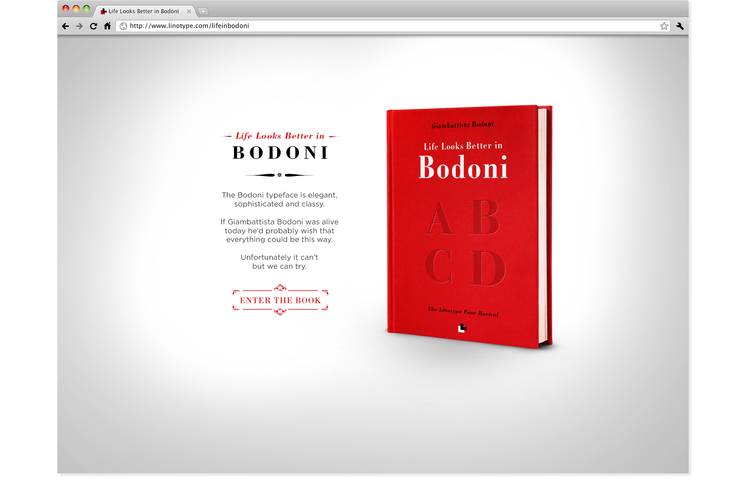
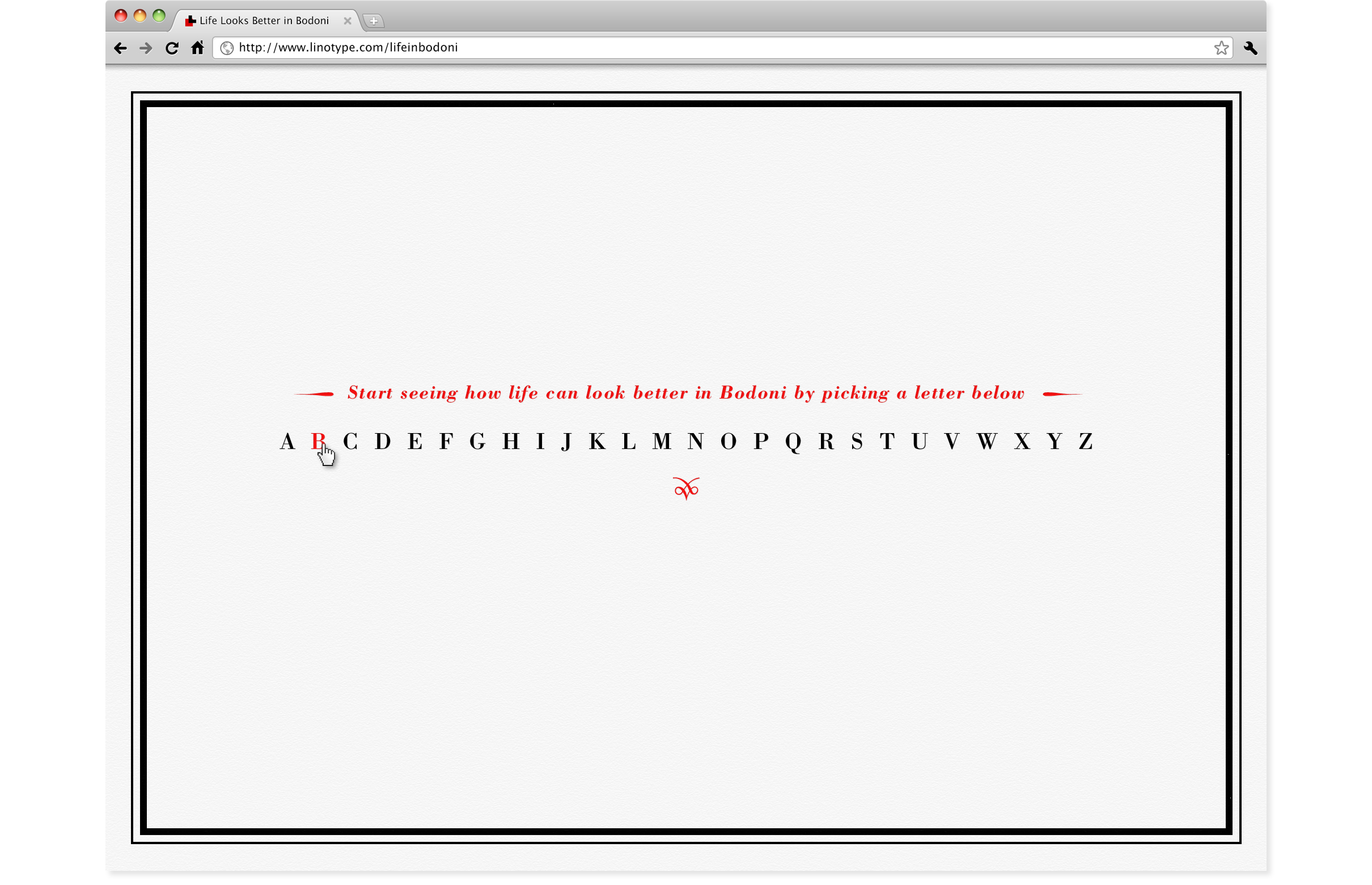
The website would feature Bondoni’s famous book which the users could interact to see various words featured in beautiful typeface against the not-so-beautiful images.
Mobile App
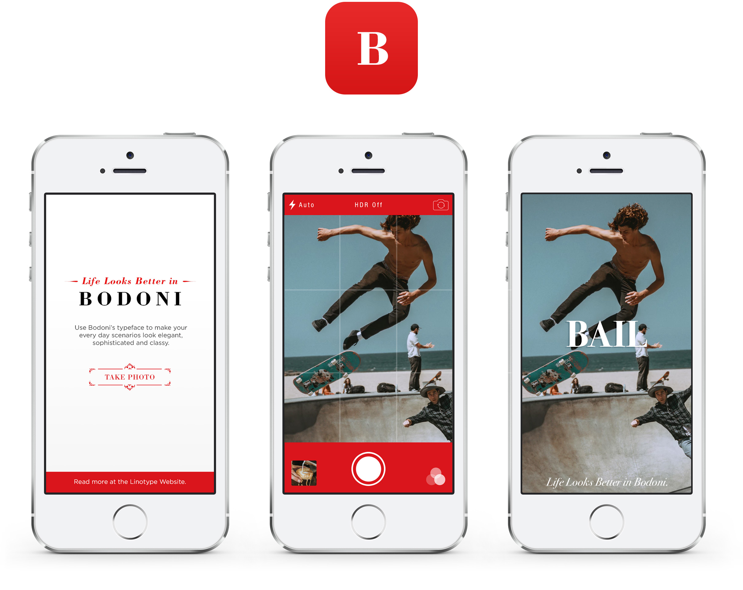
For fun our mobile app would allow users to take photos of their own everyday life and add the Bodoni typeface on top.
Ronan Murphy, is an Irish digital designer based in Naarm, Melbourne, Australia.
I acknowledge the Wurundjeri Woi-Wurrung People as the Traditional Owners of the land where I live and work. Learn about Yes 23.
email | +61 412-290-930